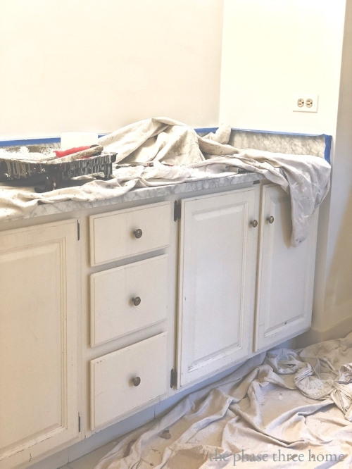
We’ve done our share of bathroom updates through the years. But gently morphing our kids’ baths into full-fledged guest baths prior to selling our home…..well, that’s a whole different animal! As with most renos and restyles, time and budget were pretty much king. But giving these baths a modern edge and broad appeal required a bit of planning. And a few hard choices. So we started with the basics:
decide what needed to be replaced
decide what just needed an update or refresh
and last but not least, our favorite option….decide what required nothing at all.
With a revised high-style-on-a-low-budget focus, we put our usual criteria aside and moved forward with a super cost-friendly, yet on-trend aesthetic. So, bye-bye custom cabinetry options. So long vanities and accessories currently featured by some of my fave retail brands, (see 7 Vanities, Perfect for a Kids’-Turned-Guest Bath Restyle). Welcome, Plan B!
Here’s how we gently transformed our well-used kids’ baths into inviting, guest-quality spaces that now fit the updated, fine-casual vibe of our home…..just in time to pop this old girl on the market!
step one: vanities
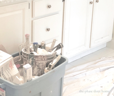
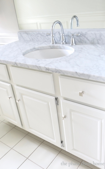
VANITY BASES So that second option about how some things just needed an update or refresh? That’s what these vanity bases were all about. Sure, they were no spring chickens, but lucky for us, were in great shape. Yippee! A quick make-over….sanding, fresh paint and new hardware and they were good to go.
Ben Moore’s White Dove—-a personal perennial favorite—— was just the thing to give the girl’s single sink vanity a bright, clean look. For the boys’ jack and jill bath, the double sink vanity base, that somehow survived years of heavy assault, looked like new after Benjamin Moore’s Silver Chain (below)…. the perfect shade of pale gray.
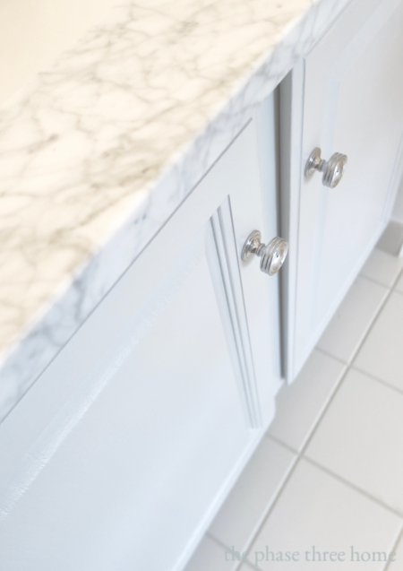
VANITY TOPS The thirty year old vanity tops, on the other hand, had seen better days. And needed a modern edge. A trip to a local stone fabricator turned out to be just what the doctor ordered: Two slabs of Carrara marble in just the right size with just the right veining. Perfect.
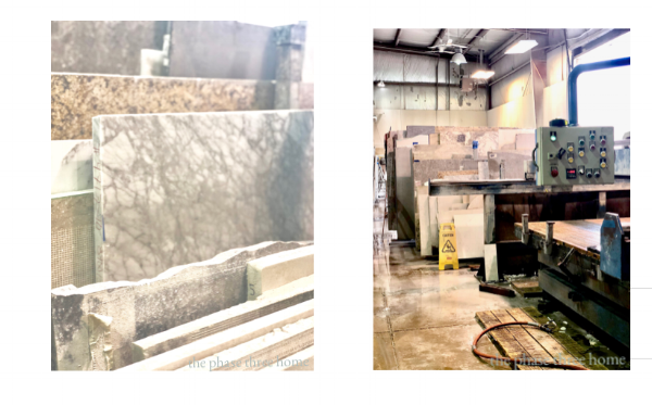
*quick tip: Planning this project ourselves—without a contractor—allowed us to work directly with the fabricators, saving us money and keeping our budget right on track. Good to know if you’re considering a cost-friendly bath update.
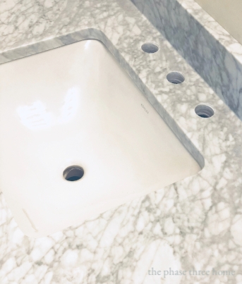
SINKS & FIXTURES After shopping sinks at all my usual big box hang outs, we actually found comparably priced Kohler sinks available through the stone fabricator. A real time saver. Sinks were then placed at the same time as the vanity tops; one round for our single and two square sinks—always my top choice—for the double vanity.
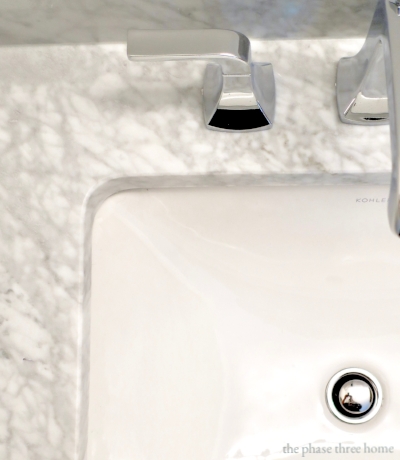
On to the fixtures. I was pleasantly surprised to find a really great selection of quality brands, styles and price points at Home Depot. I fell in love with these graceful, clean-lined Kohler fixtures for the double vanity (above). And these charming, shapely chrome fixtures (below), by Moen, for the single.
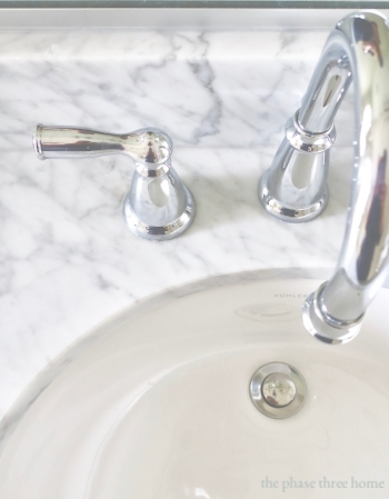
It’s amazing how simple upgrades in a space such as this, can completely change the look and feel. Each updated vanity added a fresh, stylish new vibe to their baths— while staying on budget and on time. I’d say that’s a pretty good start!
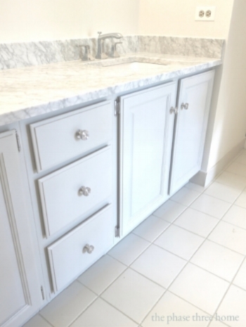
Even at this point in the restyle, all I can say is…. what an improvement! So well worth the last minute craziness.
Next, on to Step Two: Toilets, mirrors, accessories and a couple cost-saving improvements that totally seal the deal.